
Williamsburg’s Colonial Climate: What Can Be Learned from Thomas Jefferson’s Data?
The coronavirus pandemic has turned the modern world on its head, and for the remainder of the 2020 spring semester William & Mary will teach its courses from a distance. This won’t be easy, and the instruction is not going to equal the in-class or the in-lab experience that would normally take place.
As I prep for the rest of the semester, I’ve watched Williamsburg’s spring season unfurl from the window of my home office. Plants are blooming, leaves are leafing out, and pollen is in the air. The nature of the seasons and regional climates are topics that we explore in my Weather, Climate, & Change course. It’s a big bummer that our academic adventure can no longer meet in person or go to the field to collect data, but we will carry on. And I’ll use this blog to provide content and flavor.
In 1760, Thomas Jefferson matriculated at William & Mary, although he never took my Weather & Climate course he started making systematic weather observations while a student in Williamsburg. In the wide-ranging treatise entitled Notes on the State of Virginia published in 1785(7)1, Jefferson discusses Virginia’s climate. In Query VII, he includes weather data collected in Williamsburg between 1772 and 1777. This was an important time in Jefferson’s life. In 1772 he’d been elected to the House of Burgesses (which brought him back to Virginia’s colonial Capital), and in 1776 wrote the Declaration of Independence.
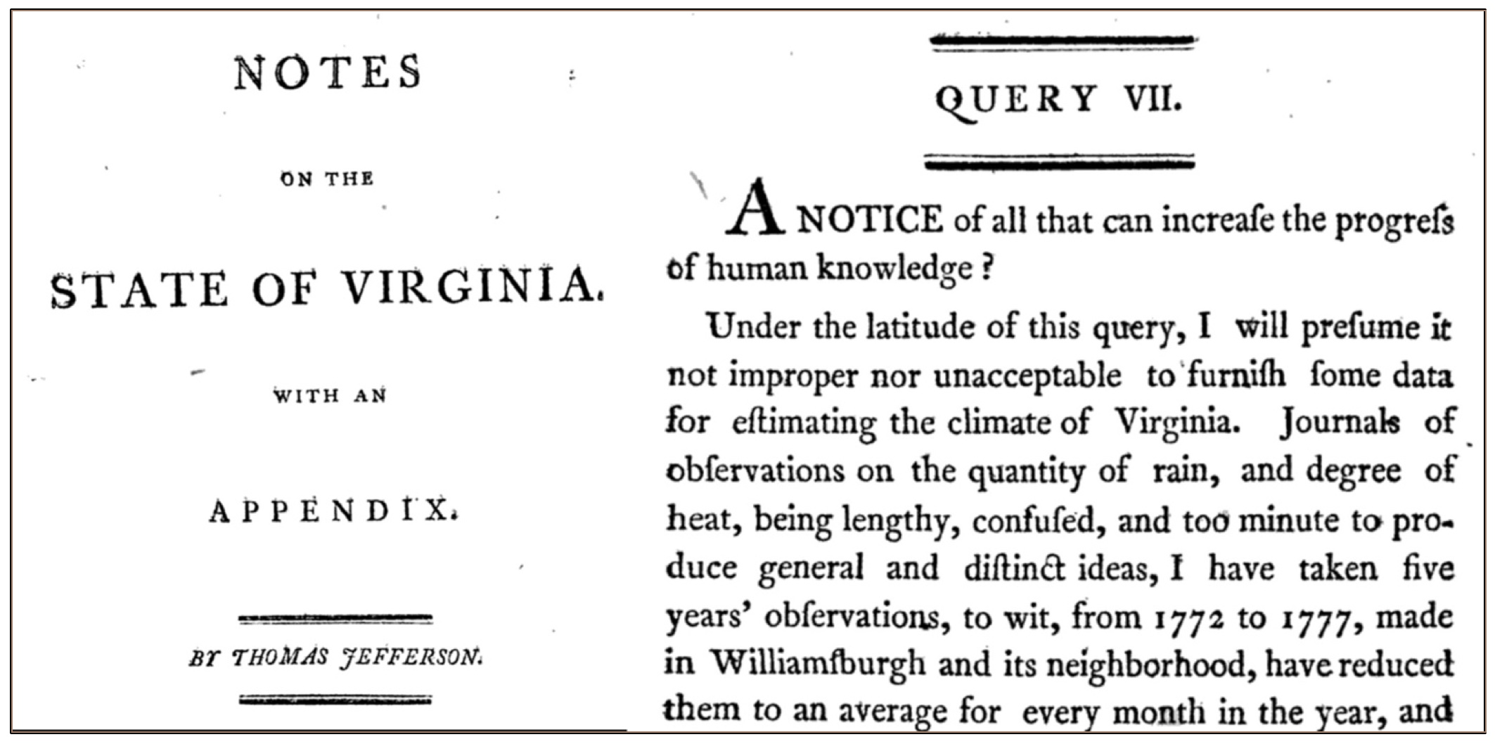
Frontispiece and first page of Query VII from Thomas Jefferson’s Notes on the State of Virginia.
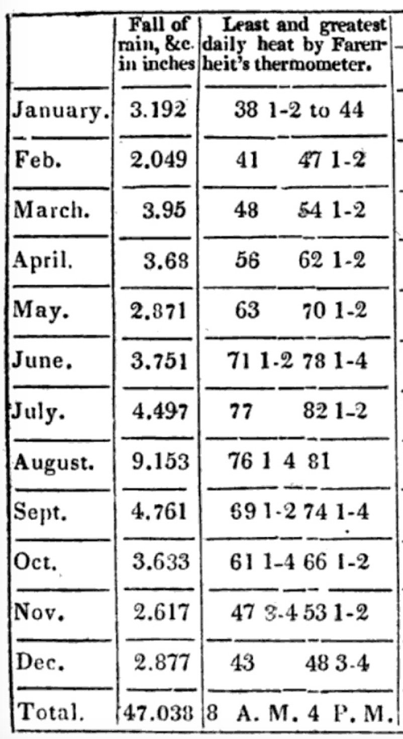
Jefferson’s table of monthly averages for precipitation and temperature.
For those interested in past climates, accurate historical climate data are the gold standard. Data obtained in Williamsburg during the late 18th century might enable us to discern whether Williamsburg’s climate has changed over the past two centuries.
Jefferson notes that the temperature in Williamsburg was recorded at 8 a.m. (least daily heat) and 4 p.m. (greatest daily heat) on Fahrenheit’s thermometer. Rather than providing all the data, which was ‘too minute’ for easy comprehension, Jefferson compiled a table with the monthly average values of the greatest (highest) and least (lowest) temperature. Earlier this semester, on the first problem set in Weather, Climate, & Change, I asked students to use Jefferson’s temperature data to produce a winsome graph.
Every time we make a graph, we make a set of choices – which variable should be on which axis? What type of graph (bar graph, scatter plot, etc.)? Should the date be plotted as discrete points or connected as a continuous function? Even font size, the shapes of data points, and colors matter when it comes to making graphical data tell an effective story.
The plots produced by the 28 students in Weather, Climate, & Change were a mixed bag, but for many of these first-year students it was the first graph that they had produced in college. One goal for the remains of the semester is to produce better and more compelling graphs and charts.
My graph is below. I chose to plot the greatest heat and least heat values as discrete symbols, and not connect those symbols with a line, as these data are not a continuous time series. Rather it’s discrete data (monthly).
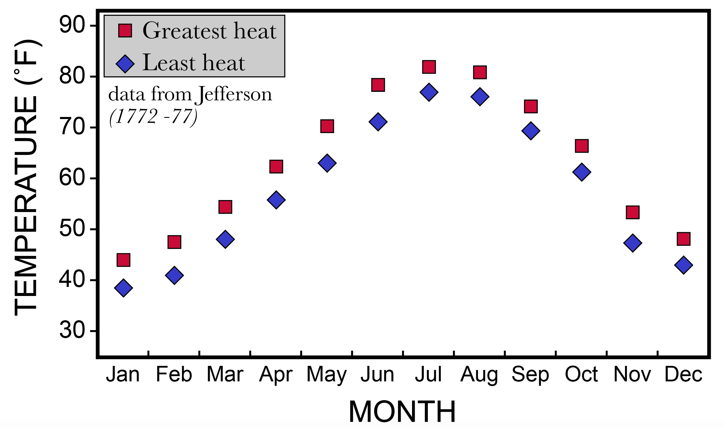
A graph of Jefferson’s temperature data for Williamsburg, Virginia (1772-77).
The data illustrate a pattern that modern Williamsburgers are familiar with – it is hotter in the summer, and cooler in the winter. The hottest months are June, July, and August, but the high temperatures for those months (~80˚ F) seem lower than what we typically experience during a modern summer. Perhaps this is evidence of climate change. To test that, I’ve crafted a second graph with Jefferson’s 1772-1779 data plotted next to modern temperature data from William & Mary’s Keck Lab.
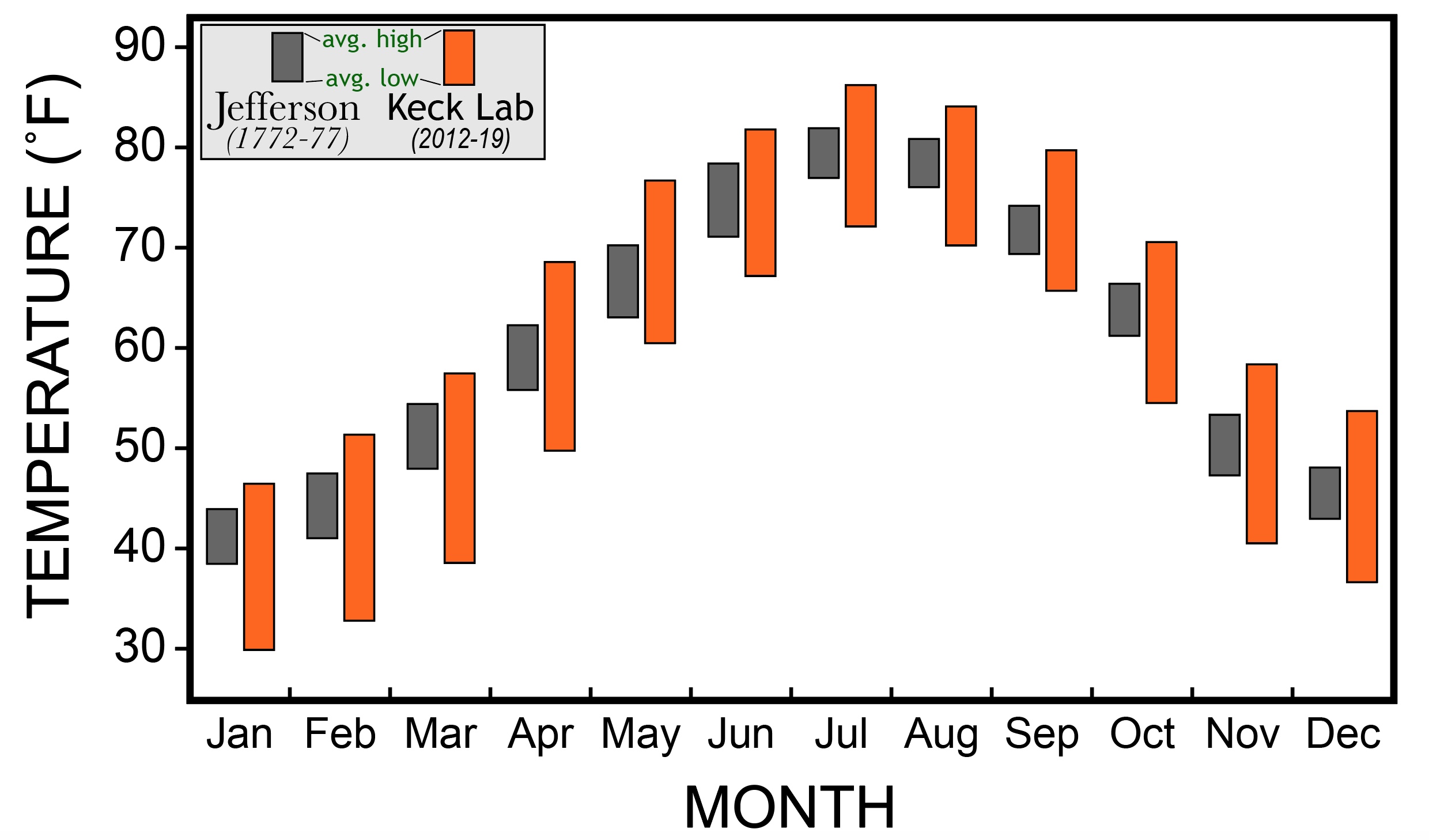
A graphical comparison of Thomas Jefferson’s data (1772-77) to modern climate data (2012-2019) from William & Mary’s Keck Lab. Note the big differences in average high and low temperatures as well as the monthly variation.
Both data sets follow a similar yearly trend, yet there are some striking differences. Modern high temperatures are greater than the historical highs in every month, but the modern lows are also lower than the 18th century lows in every month. If this difference is the result of global warming, we might predict higher highs, as well as higher lows for the modern data – that’s not what is observed. The graph clearly illustrates that the modern monthly temperature variation is much greater than reported by Jefferson. Jefferson’s monthly temperature variation ranges between 5˚ and 7˚ F, whereas the modern data yields variations between 14˚ and 19˚ F.
What’s up with that?
The answer lies in where the temperature data was collected. The Keck Lab’s weather station is a snazzy piece of meteorological equipment that’s located outdoors, as are all 21st century weather stations. Jefferson, as was common practice in the 1770s, collected temperature data indoors – likely in an unheated room on the north-side of a building! This was in accord with recommendations from the British Royal Society, and in 1772 Virginia was still very much a part of the British Empire.
With this insight, the difference in the two data sets makes perfect sense. The thermal inertia of a building moderates indoor temperatures relative to the outside temperatures. Thus, the temperature variation recorded in such a data set will be less than the actual outdoor variation.
By the 1790s, Jefferson was unsatisfied with indoor temperature measurements, and at the urging of his friend James Madison moved his equipment outdoors. In 2007, Susan Solomon and her colleagues published an excellent article that outlines the history of this revolution in weather-monitoring practices between the 18th and 19th century.
One of the projects in the Weather, Climate, & Change class is to study the climate associated with a particular crop, and the climatic controls that influence where certain crops are grown. Mangos don’t grow in Virginia; why not? Students will collect climate data from a number of sources, and then distill that into a cogent presentation about the crop in which they are interested. I’ll post the best graphics, charts, and maps here so the world can see the fruits of my students’ labors!
Take good care.
1- Jefferson’s book was first published in Paris to a small audience in 1785, it’s first publication in America was in 1787.
Comments are currently closed. Comments are closed on all posts older than one year, and for those in our archive.
Be best