
It All Averages Out
This morning I handed back the graded mid-term exam to the Geology 312- Weather, Climate, and Change class. The average (or mean) score was 78% with the high grade topping out at 92%. The grade distribution is skewed to the left (that is there is a long tail of lower grades) with a noticeable absence of high-end grades- this is a typical pattern in the larger classes that I teach. My exams are difficult and given the time constraint set by an hour-long exam, scores in the high 90’s are quite rare. Students earning scores of 85% did great. I don’t assign letter grades per se, but from the illustration below you get a sense of my thinking on that matter.
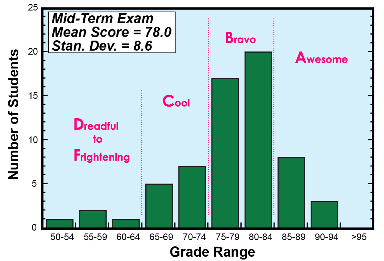
Grade distribution for GEO 312 mid-term exam
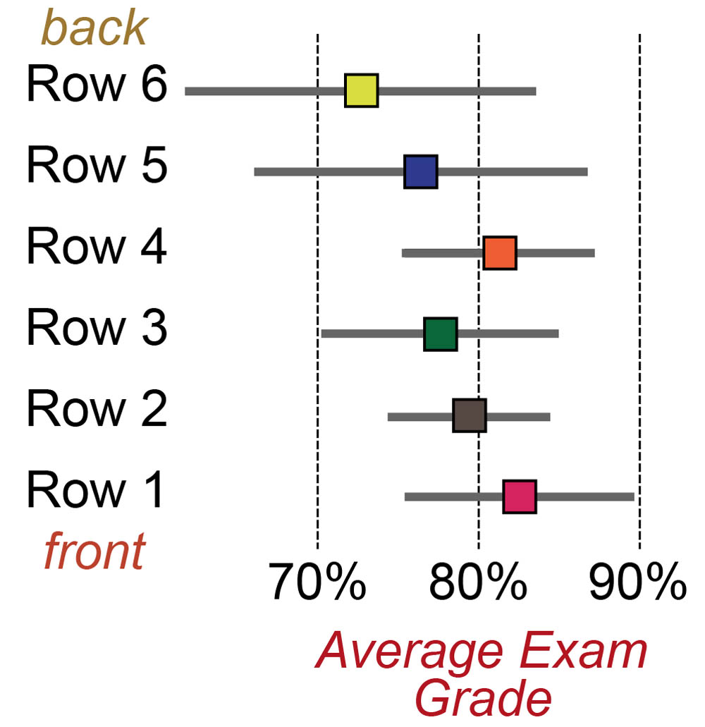 Students are creatures of habit and typically sit in the same seat throughout the semester, thus I was able to determine the average grade per row. The classroom (Tyler Hall 102) has six rows- between 9 and 12 people sit in each row. There are some discernible trends in exam scores between the rows. Row 1 (the front row) had the highest average and the row average dropped back to Row 3, there is a curious ‘grade inversion’ between Row 3 and 4, and then the grades fall off towards the back row. Now these are just averages for the rows, not everybody in the back row did poorly. A measure of grade variation per row is given by the standard deviation (shown as the gray horizontal lines), note the wider spread in grades in the back two rows. So just what is the best row to sit in? The use of averages and standard deviations will be important as the class works on their regional climate projects, discerning the variability of temperature and precipitation over time.
Speaking of averages, the cumulative precipitation for 2011, measured at William & Mary’s Keck Environmental Field Lab, is spot on for an average year. Typically, by the second week of October, Williamsburg has received just over 1,000 mm (1 meter or 39 inches) of precipitation- this is based on time series data collected between 1949 and 2010.
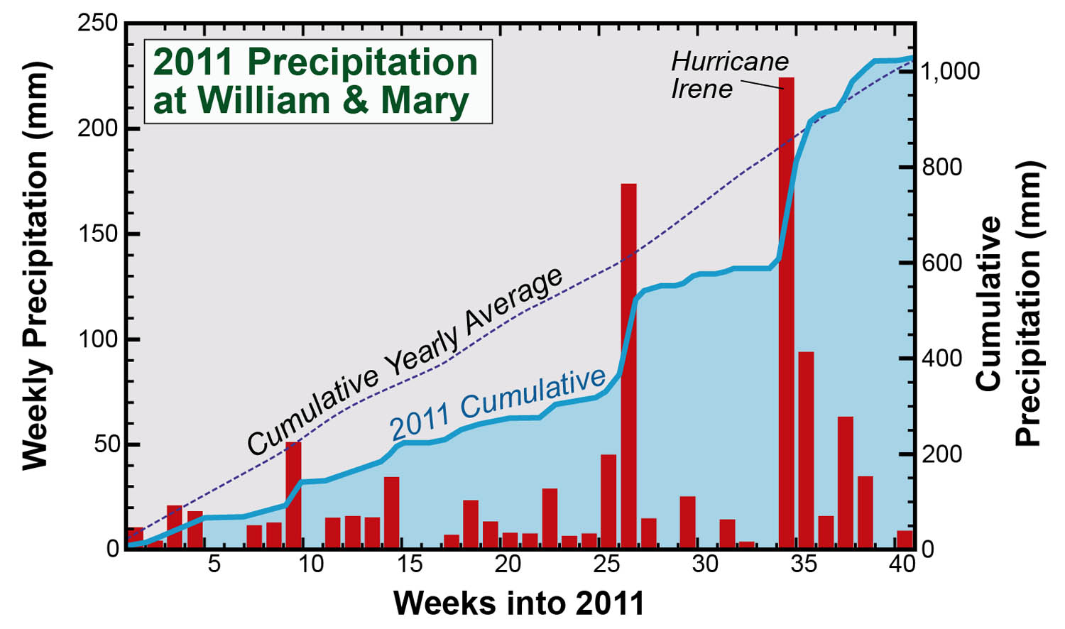
An average year might not seem so interesting, but how the average was reached is more informative. The plot above illustrates the weekly precipitation (red columns), the cumulative precipitation for 2011 (the thick blue line), and the cumulative yearly average (dashed purple line), which steadily climbs throughout the year. Precipitation events, such as the passage of weather fronts and thunderstorms, do not occur at an even or measured pace. Some weeks Williamsburg receives no precipitation, whereas other weeks we get drenched. By mid-August (week 33) campus had received 600 mm of precipitation for the year and was over 25% below average. Hurricane Irene (in late August) changed all that by adding over 200 mm in just under a day. As summer turned to fall, a consistent flow of southerly air has repeatedly brought rain to Williamsburg and in the process topped up W&M’s rain gauges to their long-term average. La Niña conditions are set in the equatorial Pacific Ocean, this typically brings warmer and potentially wetter conditions to the mid-Atlantic. There are still some 10 weeks left in 2011 and it remains to be seen whether precipitation for the entire year will all average out.

Comments are currently closed. Comments are closed on all posts older than one year, and for those in our archive.
I’m wondering if most cities follow a similar rain trend to Williamsburg. That is, do most cities receive high variation in rain which averages out to year totals, or does Williamsburg’s unique levels of rainfall have to do with its geographic location? I wonder if San Francisco has a similar cumulative graph, with high variation, or if it steadily rises to reach the average.
If the outliers in the above graph represent major storms, as does the one labeled Hurrican Irene, does the major outlier before also stem from a major storm? During certain seasons, do the outliers usually come from a particular water source (aka Gulf or Atlantic)?